14 Chip And Dip Bowl Pottery Painting Ideas
Ever stare at a plain ceramic chip and dip bowl, feeling utterly uninspired?
That sad, blank canvas just screams “boring party,” and honestly, who has time for boring?
Well, darling, we’re about to fix that. Get ready to unleash your inner Picasso on some pottery because these ideas are pure snack-time genius.
1. Retro Geometric Groove
- Best For: Throwback parties, mid-century modern enthusiasts.
- Vibe: Groovy, Mad Men chic.
- Why it works: It adds instant cool points to any snack spread.
Grab some painter’s tape and map out bold geometric shapes across your bowl. Think trapezoids, circles, and triangles for peak retro vibes.
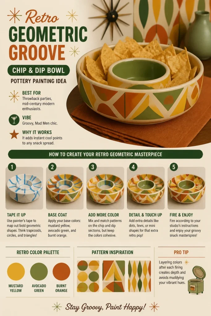
Use a palette of mustard yellow, avocado green, and burnt orange for that authentic vintage feel. Don’t be afraid to mix and match patterns on the chip and dip sections, but keep the colors cohesive.
Pro Tip: Layering colors after each firing creates depth and avoids muddying your vibrant hues.
2. Coastal Coral Reef
- Best For: Beach house gatherings, summer BBQs.
- Vibe: Breezy, oceanic escape.
- Why it works: It brings the calming essence of the sea right to your table.
Paint a vibrant underwater scene with various shades of teal, aqua, and sandy beige. Focus on intricate coral patterns and maybe a few playful fish silhouettes.

Use a sponge technique for textured coral, making it look almost real. A light blue wash for the background will give the illusion of water.
Pro Tip: Use a fine-tipped brush for delicate details like tiny fish eyes or coral polyps.
3. Abstract Expressionist Splash
- Best For: Modern art lovers, spontaneous creatives.
- Vibe: Bold, artistic, slightly chaotic.
- Why it works: It’s virtually impossible to mess up, making it perfect for beginners.
Forget precision. Drip, splatter, and brush vibrant colors like electric blue, hot pink, and lime green onto your bowl. Think Jackson Pollock, but for chips.
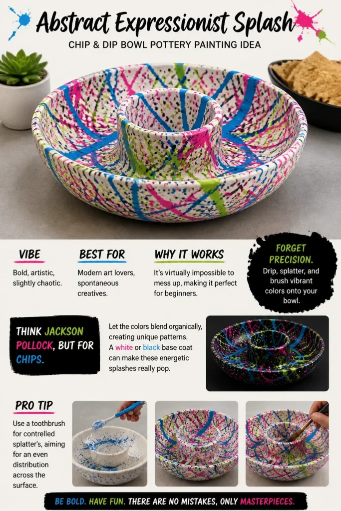
Let the colors blend organically, creating unique patterns. A white or black base coat can make these energetic splashes really pop.
Pro Tip: Use a toothbrush for controlled splatters, aiming for an even distribution across the surface.
4. Botanical Bliss Foliage
- Best For: Garden parties, nature enthusiasts.
- Vibe: Serene, earthy, natural.
- Why it works: It adds a touch of organic elegance without being overly fussy.
Hand-paint delicate leaves and vines in varying shades of forest green and olive onto a creamy white background. You could even add a few subtle floral accents.
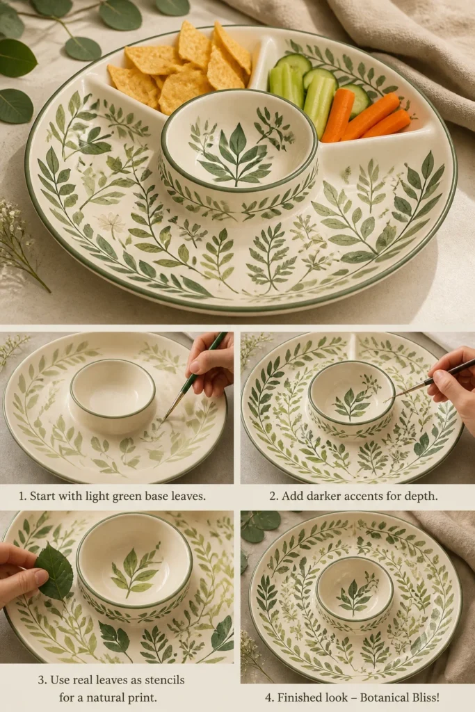
Consider using actual leaves as stencils for a realistic print. Just press them onto the wet paint carefully, then peel away.
Pro Tip: Start with lighter greens for the base leaves, then add darker accents for depth and shadow.
5. Whimsical Polka Dot Parade
- Best For: Kids’ parties, playful adults.
- Vibe: Cheerful, fun, eternally classic.
- Why it works: It’s simple, iconic, and always brings a smile.
Choose two to three contrasting colors like navy blue, sunny yellow, and crisp white. Use different-sized dotting tools to create a playful polka dot pattern all over the bowl.
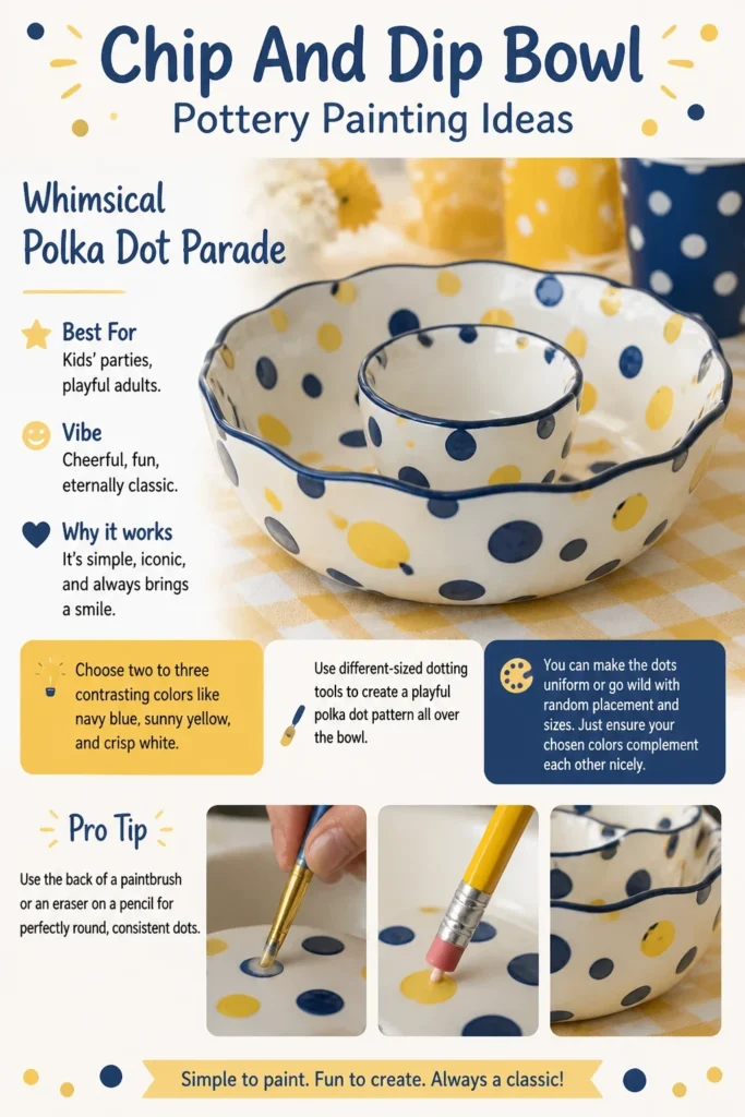
You can make the dots uniform or go wild with random placement and sizes. Just ensure your chosen colors complement each other nicely.
Pro Tip: Use the back of a paintbrush or an eraser on a pencil for perfectly round, consistent dots.
6. Galactic Starry Night
- Best For: Sci-fi movie nights, cosmic-themed gatherings.
- Vibe: Mysterious, awe-inspiring, otherworldly.
- Why it works: It turns snack time into a journey through the cosmos.
Paint the bowl a deep indigo or black for the night sky. Then, use a sponge or a stippling brush with lighter blues, purples, and even a touch of silver for nebulas.
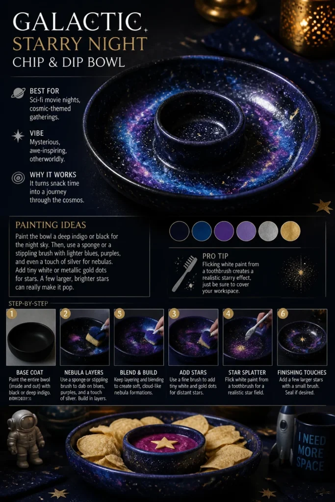
Add tiny white or metallic gold dots for stars. A few larger, brighter stars can really make it pop.
Pro Tip: Flicking white paint from a toothbrush creates a realistic starry effect, just be sure to cover your workspace.
7. Southwestern Desert Sunset
- Best For: Rustic decor, outdoor entertaining.
- Vibe: Warm, earthy, adventurous.
- Why it works: It brings the beauty of the desert landscape indoors.
Create a gradient effect starting with deep terracotta at the base, blending into sandy beige, and finishing with a peach or light orange at the rim. Add simple cactus silhouettes in black.
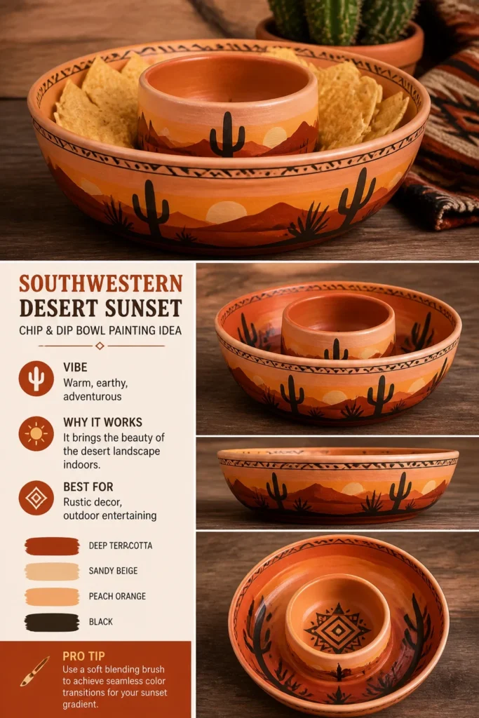
You can also incorporate geometric patterns inspired by Native American art. Keep the colors warm and inviting, like a true desert evening.
Pro Tip: Use a soft blending brush to achieve seamless color transitions for your sunset gradient.
8. Pop Art Comic Book Style
- Best For: Comic book fans, quirky personalities.
- Vibe: Bold, graphic, energetic.
- Why it works: It adds a fun, retro-modern twist to your snack presentation.
Outline your chosen design, perhaps a “CRUNCH” or “YUM” bubble, in thick black lines. Fill it in with bright, solid colors like primary red, yellow, and blue.
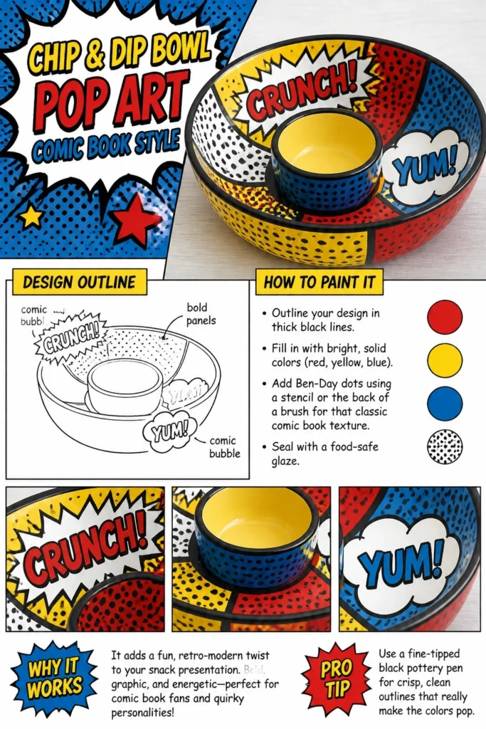
Add Ben-Day dots using a stencil or the back of a brush for that classic comic book texture. Think Roy Lichtenstein, but on a bowl.
Pro Tip: Use a fine-tipped black pottery pen for crisp, clean outlines that really make the colors pop.
9. Minimalist Monochromatic
- Best For: Modern homes, understated elegance.
- Vibe: Sleek, sophisticated, effortlessly chic.
- Why it works: It proves that less is often, well, more.
Choose a single color, like a deep charcoal grey, a muted sage, or a serene navy. Paint the entire bowl this color, then add subtle patterns or textures using a slightly lighter or darker shade of the same hue.
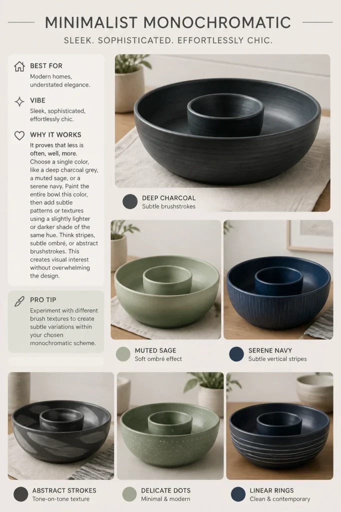
Think stripes, subtle ombré, or abstract brushstrokes. This creates visual interest without overwhelming the design.
Pro Tip: Experiment with different brush textures to create subtle variations within your chosen monochromatic scheme.
10. Fruity Fiesta Fun
- Best For: Summer parties, healthy snack enthusiasts.
- Vibe: Zesty, refreshing, deliciously vibrant.
- Why it works: It makes your snacks look even more appealing.
Paint your bowl with cheerful illustrations of your favorite fruits. Think bright yellow lemons, juicy red watermelons, or zesty green limes.
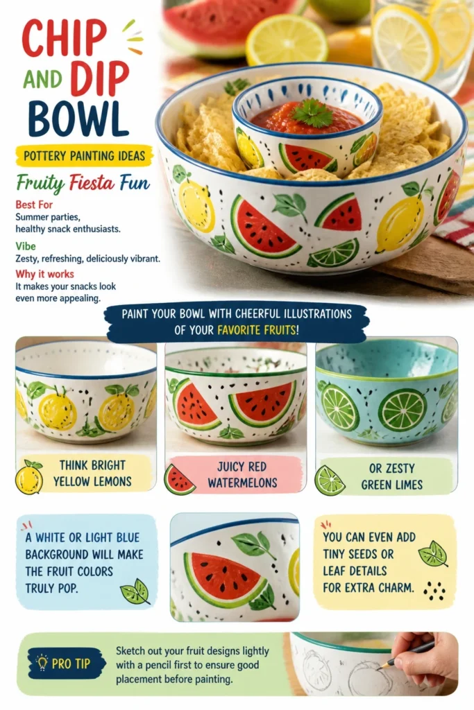
A white or light blue background will make the fruit colors truly pop. You can even add tiny seeds or leaf details for extra charm.
Pro Tip: Sketch out your fruit designs lightly with a pencil first to ensure good placement before painting.
11. Animal Print Wild Child
- Best For: Fashion-forward hosts, those who dare to be bold.
- Vibe: Sassy, edgy, a little bit fierce.
- Why it works: It’s a guaranteed conversation starter at any gathering.
Channel your inner fashionista with leopard spots, zebra stripes, or even subtle snake print. Use classic colors like black and tan for leopard, or black and white for zebra.
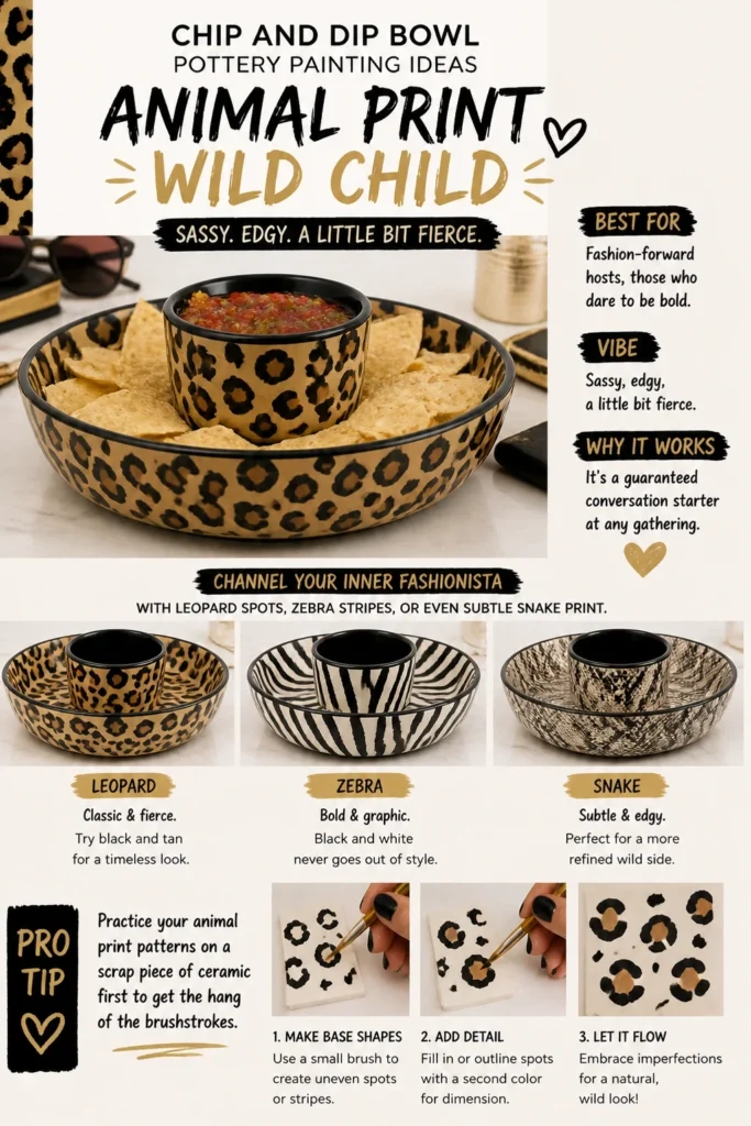
Don’t worry about perfection; natural animal prints are wonderfully imperfect. Just have fun with it.
Pro Tip: Practice your animal print patterns on a scrap piece of ceramic first to get the hang of the brushstrokes.
12. Doodle Art Delight
- Best For: Creative minds, anyone who loves to draw.
- Vibe: Playful, personal, wonderfully unique.
- Why it works: It’s a canvas for your everyday whims and ideas.
Grab a ceramic marker in black or a dark color and simply doodle away. Think tiny stars, squiggles, abstract shapes, or even silly faces.
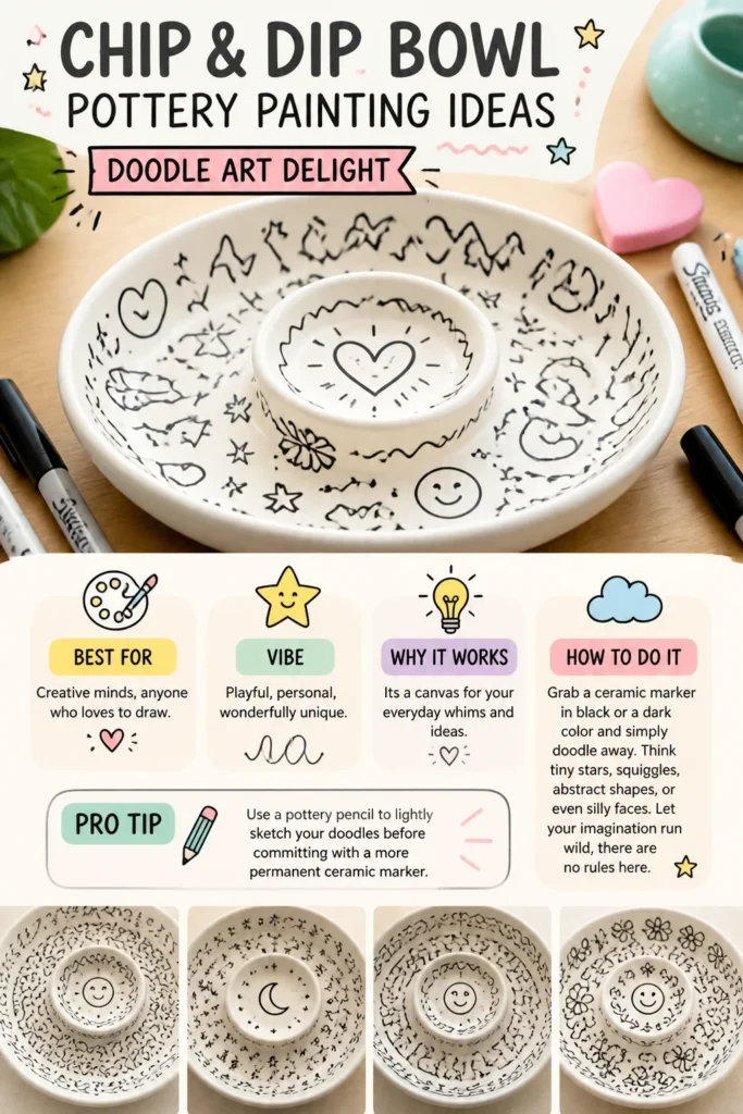
Let your imagination run wild; there are no rules here. A white base coat helps your doodles stand out beautifully.
Pro Tip: Use a pottery pencil to lightly sketch your doodles before committing with a more permanent ceramic marker.
13. Ombré Sunset Gradient
- Best For: Relaxed evenings, romantic settings.
- Vibe: Soothing, dreamy, effortlessly beautiful.
- Why it works: The smooth color transition is incredibly calming and sophisticated.
Choose three to four colors that blend well, like deep purple, magenta, orange, and pale yellow. Apply them in horizontal bands, blending gently where they meet.
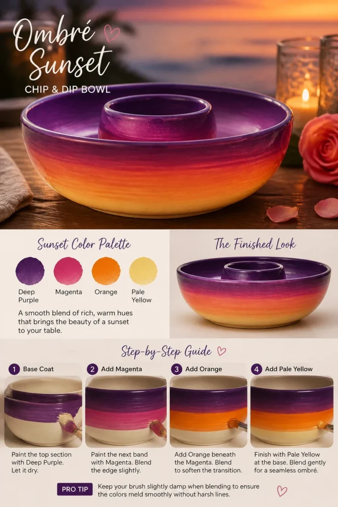
The goal is a seamless transition from one color to the next, just like a real sunset. This technique requires a bit of patience, but the result is stunning.
Pro Tip: Keep your brush slightly damp when blending to ensure the colors meld smoothly without harsh lines.
14. Faux Marble Magic
- Best For: Luxurious entertaining, sophisticated tastes.
- Vibe: Elegant, high-end, surprisingly achievable.
- Why it works: It looks incredibly fancy without breaking the bank or requiring expert skills.
Start with a base coat of white or light grey. While it’s still wet, add thin, squiggly lines of a contrasting color like dark grey or gold.
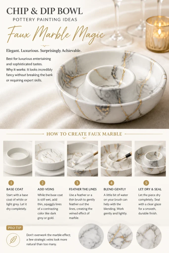
Use a feather or a thin brush to gently feather out these lines, creating the veined effect of marble. A little bit of water on your brush can help with the blending.
Pro Tip: Don’t overwork the marble effect; a few strategic veins look more natural than too many.
Our Top Recommended Finds
- High-Quality Ceramic Paint Set: Investing in good paints ensures vibrant colors and better durability after firing.
- Detail Brush Kit: A variety of brush sizes, especially fine-tipped ones, makes intricate designs much easier to achieve.
- Pottery Glaze Sealant: This crucial step protects your masterpiece and makes it food-safe and dishwasher-friendly.
Which of these will you try first?
So, there you have it, 14 ways to rescue your chip and dip bowl from the clutches of blandness.
No more sad, plain pottery on your snack table, please. Now go forth and create something ridiculously fabulous.
Which of these genius ideas is calling your name the loudest?