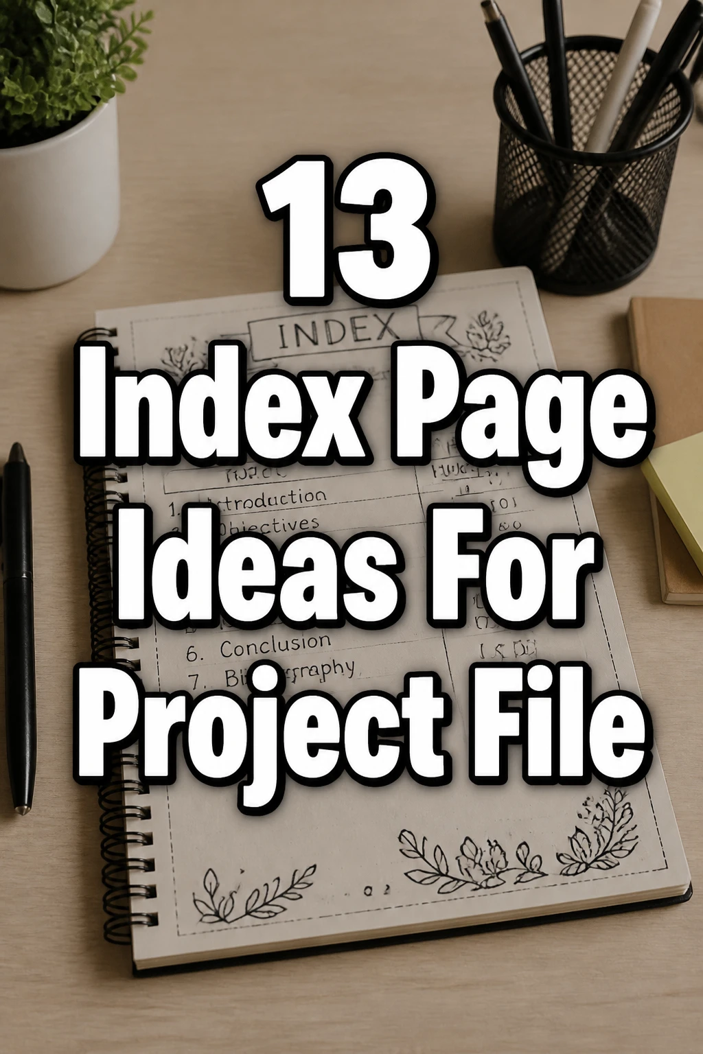
13 Index Page Ideas For Project File
Your current project file looks like a total crime scene.
We both know you cannot find that one specific page without a minor breakdown.
Let us fix that mess right now with these 13 index page ideas for project file.
1. The Minimalist Grid
- Best For Professional Corporate Portfolios
- Vibe Scandinavian Cleanliness
- Why it works It uses negative space to guide the eye effortlessly.
Grab some ultra-fine black liners and a sturdy ruler for this layout.
You want to keep the layout open and airy with no unnecessary flourishes.
Stick to a high-quality 120 GSM white paper to prevent any ink bleed through the pages.
Pro Tip Use a light grey pencil to sketch the grid before committing to permanent ink.
2. Retro Scrapbook Style
- Best For Creative Arts Projects
- Vibe Nostalgic and Layered
- Why it works It hides mistakes under stylish layers of paper.
Use brown kraft paper as your base and layer it with torn edges.
Add some vintage-style washi tape to secure your section labels.
This style costs almost nothing if you use scraps from old magazines or newspapers.
Pro Tip Sand the edges of your paper with a nail file to give it an authentic aged look.
3. The Neon Color Coded System
- Best For Fast-Paced Work Environments
- Vibe High Energy and Organized
- Why it works Your brain processes colors faster than it reads text.
Assign a specific fluorescent highlighter color to every major chapter.
Match the index colors to sticky tab dividers on the side of the file.
This method works best for students who need to flip through notes during timed exams.
Pro Tip Stick to five colors or fewer to avoid looking like a rainbow exploded on your desk.
4. Hand Lettered Calligraphy
- Best For Design Portfolios
- Vibe Elegant and Sophisticated
- Why it works It shows off your personal branding and attention to detail.
Use dual-tip brush pens to create thick downstrokes and thin upstrokes.
Keep the background plain to let the copperplate script really shine.
Expect to spend a few hours practicing your flourishes on scrap paper first.
Pro Tip Draw a straight horizontal line with a ruler to keep your script from slanting upward.
5. Geometric Architecture
- Best For Engineering or Science Files
- Vibe Structured and Modern
- Why it works Sharp angles suggest precision and technical expertise.
Draft overlapping triangles or hexagons to house your different section titles.
Use metallic silver ink on dark navy cardstock for a high-end feel.
This look mimics blueprints and gives your project an immediate professional edge.
Pro Tip Use a compass to ensure your circles are mathematically perfect.
6. Interactive QR Codes
- Best For Tech Savvy Presentations
- Vibe Futuristic and Efficient
- Why it works It bridges the gap between physical paper and digital assets.
Print small QR codes next to each index item that link to video demos or websites.
Keep the rest of the page very simple with sans-serif fonts like Helvetica.
This is perfect for projects that include audio files or external research links.
Pro Tip Test every single code with your phone camera before you glue them down.
7. Pressed Botanical Border
- Best For Biology or Nature Journals
- Vibe Organic and Earthy
- Why it works Natural elements provide a calming visual break.
Glue dried eucalyptus leaves or small pressed flowers around the page border.
Use muted earth tones like sage green and terracotta for the text.
Linen-textured paper adds a premium tactile feel that regular printer paper lacks.
Pro Tip Use a clear matte sealant spray to prevent the dried plants from crumbling over time.
8. Blueprint Technical Layout
- Best For Architecture Students
- Vibe Industrial and Rigorous
- Why it works The high contrast makes the text pop immediately.
Start with a deep blue cardstock and use a white gel pen for all writing.
Draw dashed lines and measurement markers to mimic a real construction plan.
This style is incredibly cheap to produce but looks very expensive to the viewer.
Pro Tip A white paint marker provides a bolder line than a standard gel pen.
9. Pop Art Comic Style
- Best For Marketing or Media Projects
- Vibe Bold and Playful
- Why it works It grabs attention and refuses to let go.
Incorporate Ben-Day dots and bright primary colors like yellow and red.
Put your section titles inside action bubbles or jagged speech clouds.
Use a thick black permanent marker to outline every shape for maximum impact.
Pro Tip Keep your font choice simple so it does not compete with the busy background.
10. Midnight Metallic
- Best For Luxury Brand Concepts
- Vibe Moody and Exclusive
- Why it works Dark backgrounds feel more premium than standard white.
Use matte black paper as your primary canvas for the index.
Write your headings with gold or rose gold leaf pens for a metallic sheen.
This look is perfect for fashion or high-end interior design projects.
Pro Tip Clean your hands before touching black paper to avoid leaving visible oil fingerprints.
11. The Mood Board Index
- Best For Fashion or Lifestyle Projects
- Vibe Textural and Inspired
- Why it works It gives a preview of the project aesthetic before the reader dives in.
Attach small fabric swatches or paint chips next to each section name.
Use double-sided tape to keep the page flat and professional.
This allows the viewer to feel the project materials while they browse the table of contents.
Pro Tip Use a heavy cardstock base to support the weight of the attached materials.
12. Vintage Typewriter Chic
- Best For History or Literature Files
- Vibe Academic and Timeless
- Why it works It suggests a level of traditional research and authority.
Find a Courier font and print your index on slightly yellowed paper.
Add a few intentional ink smudges or crooked lines for that manual feel.
You can even use a real typewriter if you can find one at a thrift store.
Pro Tip Dip a tea bag in water and rub it on the paper to create an antique stain.
13. Neon Glow Reactive
- Best For Night School or Creative Portfolios
- Vibe Electric and Modern
- Why it works It looks standard in daylight but transforms under a blacklight.
Use UV-reactive ink or highlighters for the secondary details on the page.
Keep the primary text in bold black ink so it is always readable.
This is a great conversation starter for creative presentations or art shows.
Pro Tip Check your work under a small UV flashlight as you draw to see the hidden effect.
Our Top Recommended Finds
- Fine liner pen set to create those crisp lines and detailed hand lettering without smudging.
- Heavyweight cardstock so your index page does not tear or wrinkle after frequent use.
- Stainless steel ruler to ensure every geometric shape and grid line is perfectly straight and professional.
Which of these will you try first?
You no longer have any excuse for a chaotic and messy project binder.
Pick a style that matches your project energy and start organizing your work today.
Which design is going to save your project from the recycling bin this time?