12 First Page Decoration Ideas For Project
Staring at a blank page for your project’s first impression can feel like a creative black hole, right?
You want it to scream “I’m amazing and I put effort into this,” but your brain is drawing a blank.
Fear not, my design-challenged comrade. I’ve got the lowdown on making that first page pop without the usual stress-induced hair pulling.
Let’s dive into some seriously cool ideas that’ll make your project intro unforgettable.

1. Minimalist Modern
- Best For: Sleek presentations, professional reports, design portfolios.
- Vibe: Clean, sophisticated, effortlessly cool.
- Why it works: It communicates clarity and confidence without clutter.
Ditch the fuss. Think crisp white space, a single elegant font like Montserrat or Lato, and maybe one subtle graphic element. Use a muted color palette—think greys, soft blues, or a single bold accent color. Your title should be prominent but not overwhelming, letting the simplicity speak volumes.
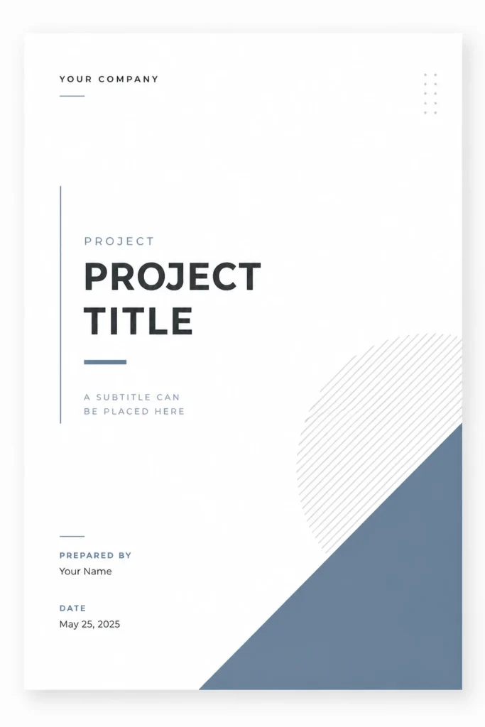
Pro Tip: Less is truly more here. Focus on precise alignment and high-quality typography to elevate the look.
2. Artistic Collage
- Best For: Creative arts projects, scrapbooks, personal journals, mood boards.
- Vibe: Eclectic, expressive, visually rich.
- Why it works: It tells a story through a curated collection of images and textures.
Grab some old magazines, fabric scraps, photos, and even dried leaves. Layer them up, tearing edges for a raw feel. Play with different textures and depths. A unifying color scheme can keep it from looking like a hot mess, but sometimes a glorious mess is exactly the point.
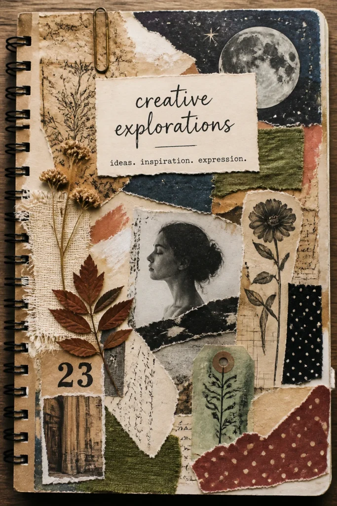
Pro Tip: Use a strong adhesive like Mod Podge to seal everything down and give it a polished, durable finish.
3. Hand-Drawn Whimsy
- Best For: Children’s projects, creative writing, artistic portfolios, quirky presentations.
- Vibe: Playful, personal, unique.
- Why it works: It adds a touch of authentic, human charm that digital can’t replicate.
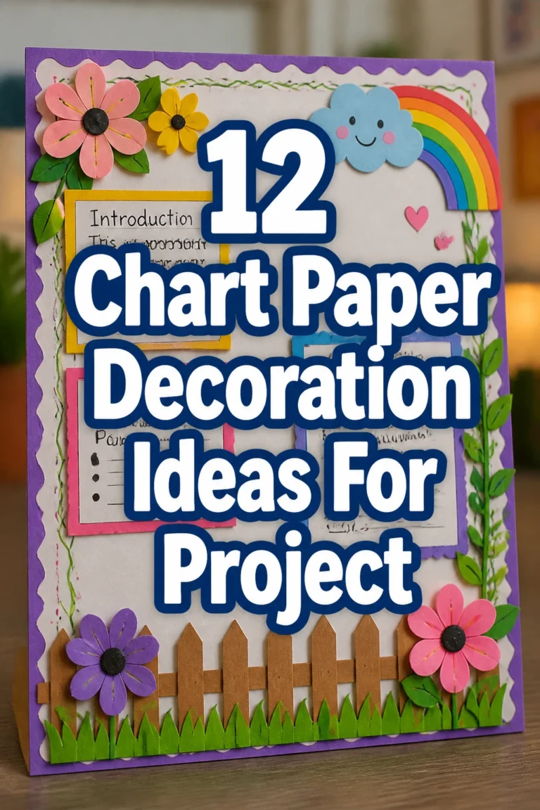
Unleash your inner doodler. Think quirky illustrations, custom lettering, or even simple borders drawn with fine-tip markers. Don’t worry about perfection; the charm is in the imperfection. Use a mix of colors to make it vibrant, or stick to black and white for a graphic novel feel.
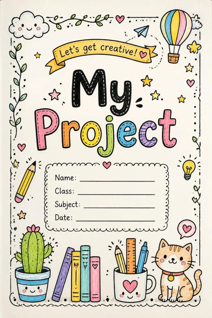
Pro Tip: Sketch your ideas lightly with a pencil first, then go over them with ink for crisp lines and fewer regrets.
4. Vintage Map Explorer
- Best For: History projects, travel journals, geography reports, adventure-themed presentations.
- Vibe: Adventurous, nostalgic, worldly.
- Why it works: It instantly evokes a sense of journey and discovery.
Find an old map — digital or physical — and use it as your background. You can layer a semi-transparent title over it, or add small, relevant illustrations like compasses or old ships. Sepia tones and faded colors enhance the antique feel. This idea is perfect for projects that explore new territories, literally or metaphorically.
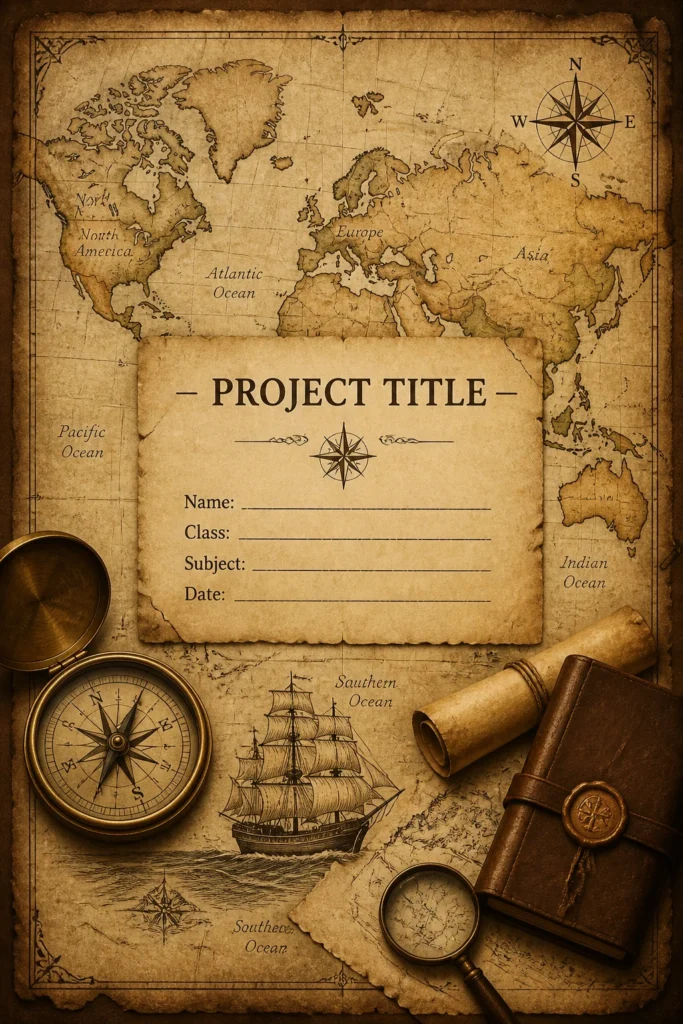
Pro Tip: Print a map on parchment paper for an extra authentic, aged look. It’s a cheap trick but super effective.
5. Bold Typography Statement
- Best For: Graphic design projects, branding proposals, impactful presentations, art manifestos.
- Vibe: Modern, powerful, direct.
- Why it works: It uses text itself as the primary visual element, making a strong, immediate impression.
Forget images. Make your project title the star using an oversized, attention-grabbing font like Impact or a custom-designed letterform. Play with different weights and sizes of the same font, or pair two contrasting fonts for dynamic tension. A limited color palette, maybe just black and a vibrant accent, keeps it sharp.
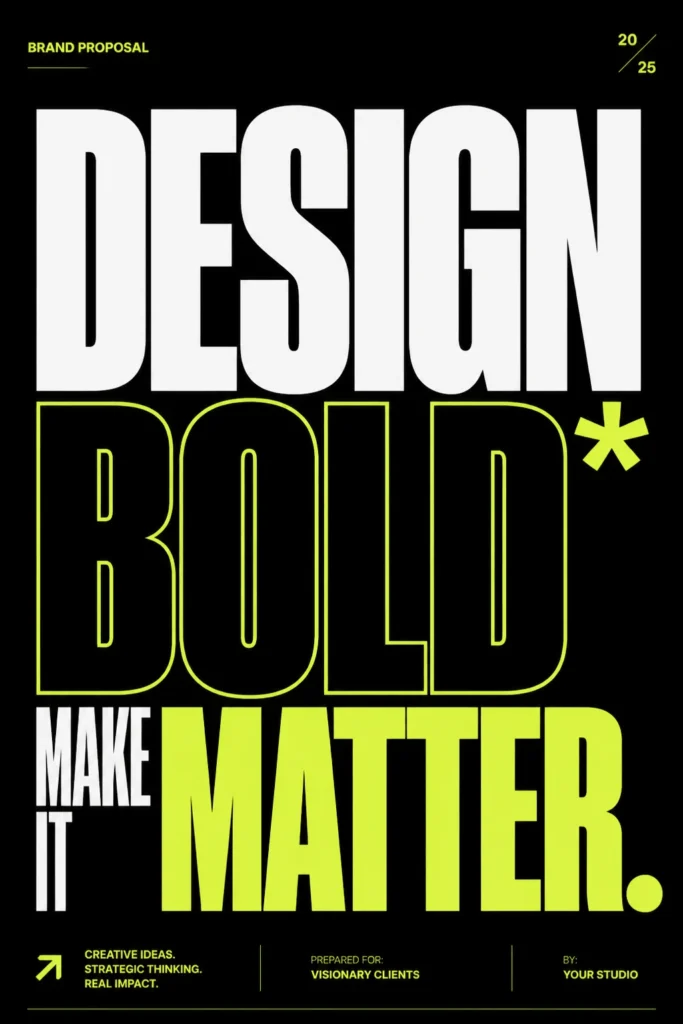
Pro Tip: Experiment with text effects like outlines, shadows, or even a subtle gradient to add depth without resorting to images.
6. Nature’s Embrace
- Best For: Environmental studies, biology projects, gardening journals, anything eco-conscious.
- Vibe: Organic, peaceful, earthy.
- Why it works: It connects your project to the natural world, suggesting growth and sustainability.
Incorporate real or drawn elements from nature. Think pressed flowers, delicate leaf patterns, or illustrations of trees and mountains. Use a color palette of greens, browns, and sky blues. A textured paper, perhaps recycled or with visible fibers, would absolutely nail this vibe.
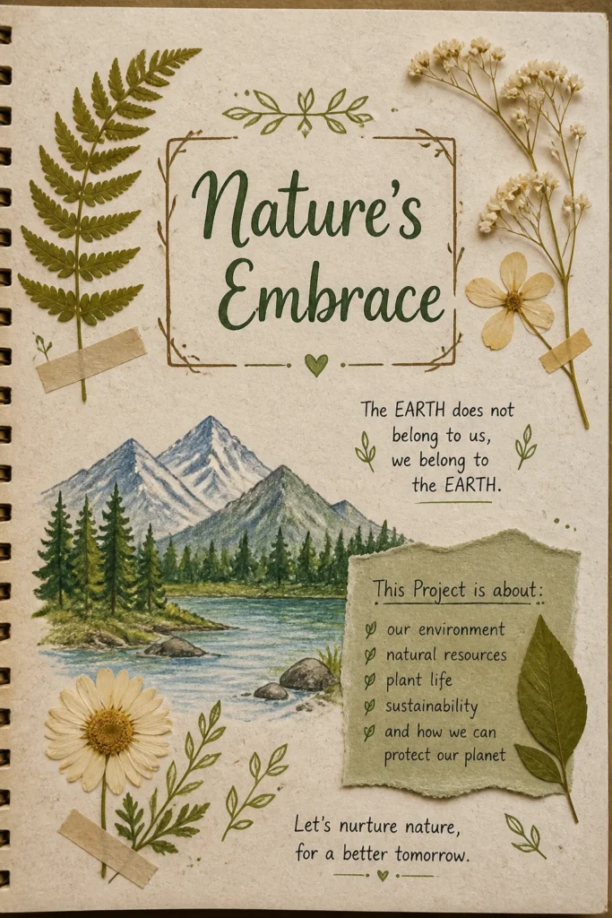
Pro Tip: Gather a few small, flat leaves or petals, press them between heavy books for a few days, then carefully glue them to your page. Instant natural art.
7. Geometric Glam
- Best For: Math projects, architecture, urban planning, abstract art.
- Vibe: Structured, modern, chic.
- Why it works: It uses precise shapes and lines to create a visually appealing, organized aesthetic.
Think triangles, squares, circles, and hexagons arranged in interesting patterns. You can use sharp, contrasting colors or a monochromatic scheme with varying shades. Overlap shapes, create tessellations, or use a single large geometric form as a framing device. A ruler and a steady hand are your best friends here.
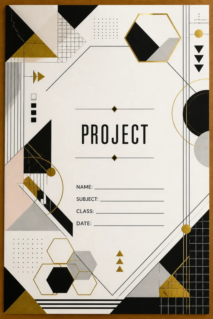
Pro Tip: Use washi tape in various widths and colors to create quick, clean geometric patterns without the need for drawing. Peel and stick, baby.
8. Photo Montage Magic
- Best For: Photography projects, personal memoirs, event recaps, visual storytelling.
- Vibe: Evocative, personal, memory-filled.
- Why it works: It immediately draws the viewer in with compelling imagery.
Select a few powerful images that encapsulate your project’s essence. Arrange them creatively—overlapping, in a grid, or with one dominant image surrounded by smaller ones. Consider a subtle filter or color overlay to unify the photos. This is your chance to show, not just tell, what your project is about.
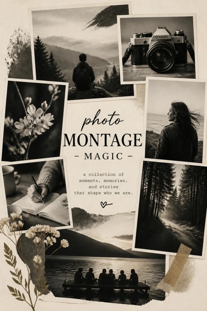
Pro Tip: Print photos in black and white or sepia for a cohesive, artistic feel, even if they were originally in color. Instant sophistication.
9. Watercolor Wonders
- Best For: Art projects, poetry collections, gentle presentations, anything needing a soft touch.
- Vibe: Dreamy, ethereal, artistic.
- Why it works: The fluid, soft transitions of watercolor create a beautiful, calming effect.
Create a background of soft, blended watercolor washes in colors relevant to your project. You can do a full-page wash, or just a splash behind your title. The beauty is in the unpredictability of the paint. Use quality watercolor paper to prevent buckling and ensure vibrant colors.
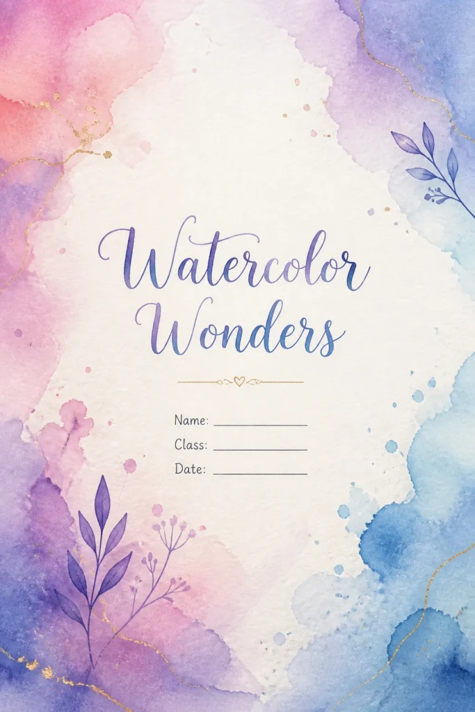
Pro Tip: For a quick watercolor effect without the mess, find high-resolution watercolor textures online and print them onto your page. Shhh, it’s our secret.
10. Comic Book Pop
- Best For: Storytelling projects, creative writing, graphic novels, presentations needing energy.
- Vibe: Dynamic, energetic, fun.
- Why it works: It’s instantly engaging and visually exciting, promising an entertaining experience.
Think speech bubbles, dynamic action lines, and bold, blocky lettering. Use a bright, contrasting color palette—red, yellow, blue are classic comic hues. You can even draw a few simple panels to frame your title or a key image. Channel your inner superhero, or supervillain, whatever works.
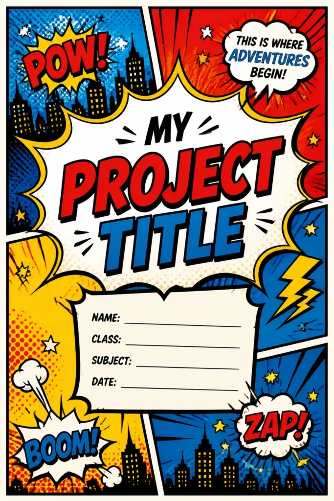
Pro Tip: Incorporate some classic comic sound effects like “POW!” or “BOOM!” subtly around your title for extra punch. It’s cheesy, but it works.
11. Techy Blueprint
- Best For: Engineering projects, coding portfolios, technical reports, futuristic concepts.
- Vibe: Precise, innovative, futuristic.
- Why it works: It suggests meticulous planning and cutting-edge design.
Use a dark background, like deep blue or black, with light-colored lines and text, mimicking a traditional blueprint. Incorporate grid lines, schematic diagrams, or circuit board patterns. A clean, sans-serif font like Roboto Mono or Consolas fits this aesthetic perfectly. Think digital, but make it tangible.
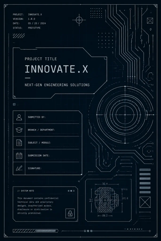
Pro Tip: Use a light grey or white gel pen on dark cardstock to draw your own circuit board patterns for a truly authentic blueprint feel.
12. Retro Future Funk
- Best For: Design projects, pop culture essays, music history, anything with a nostalgic yet forward-thinking twist.
- Vibe: Playful, vibrant, a bit rebellious.
- Why it works: It blends the best of vintage aesthetics with a modern, energetic flair.
Combine bold, chunky fonts reminiscent of the 70s or 80s with bright, neon-inspired colors. Think geometric shapes, gradient fills, and maybe a pixelated element or two. Imagine a disco ball met a spaceship and had a baby. This is your chance to go wild with color and pattern, but keep it cohesive.
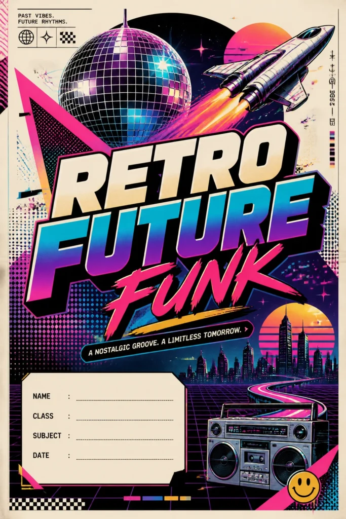
Pro Tip: Incorporate some subtle glitch effects or halftone patterns to give it that authentic retro-digital vibe. It’s all about those small, clever details.
Our Top Recommended Finds
- A reliable set of fine-tip pens: Essential for crisp lines, detailed doodles, and bold lettering in almost any style.
- A good quality glue stick or spray adhesive: For seamless collages and attaching elements without messy lumps.
- A stack of interesting textured papers: Think parchment, cardstock, or even recycled paper to add immediate depth and character.
Which of these will you try first?
See, that wasn’t so hard, was it? Your project’s first page is more than just a title; it’s a sneak peek into your brilliance.
Go forth and decorate that page like the creative genius you are. Let us know which idea sparks your next masterpiece in the comments below!