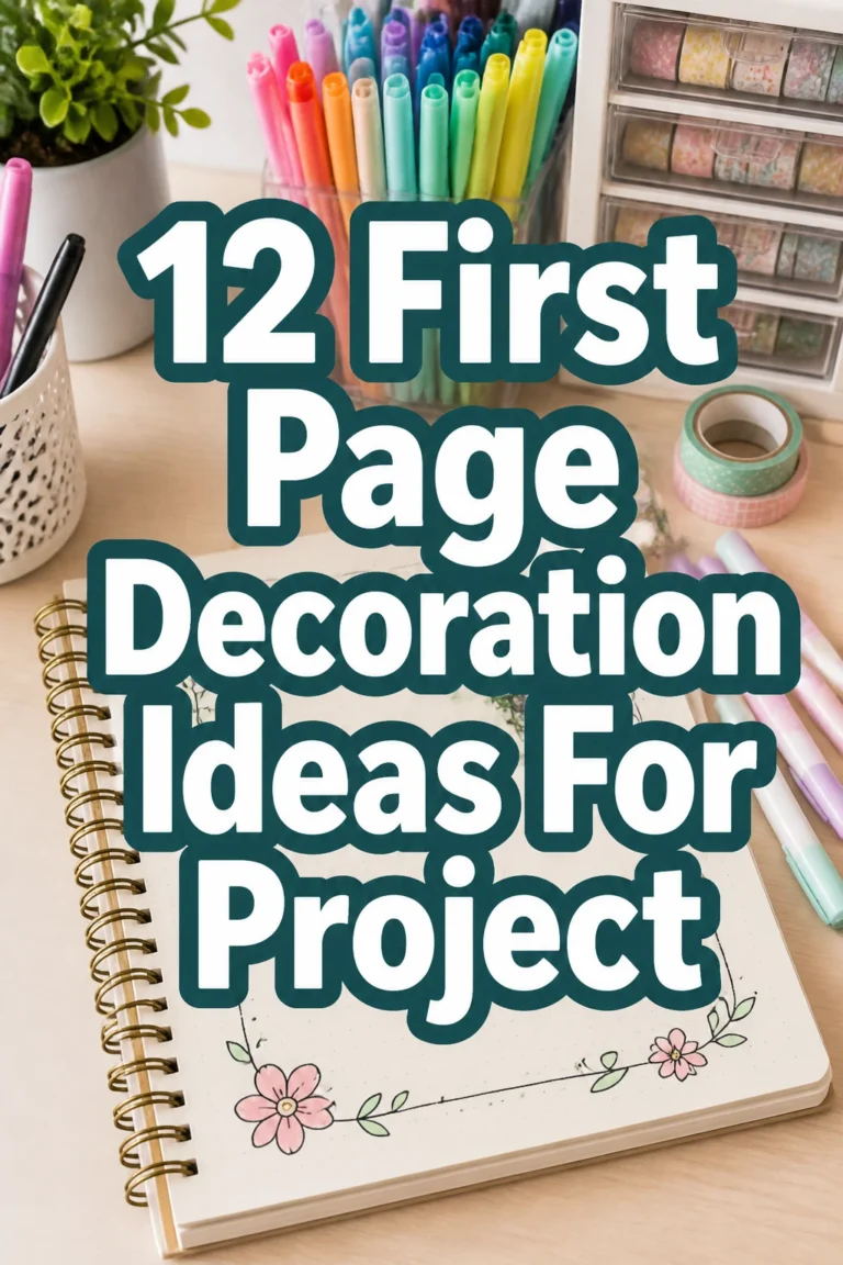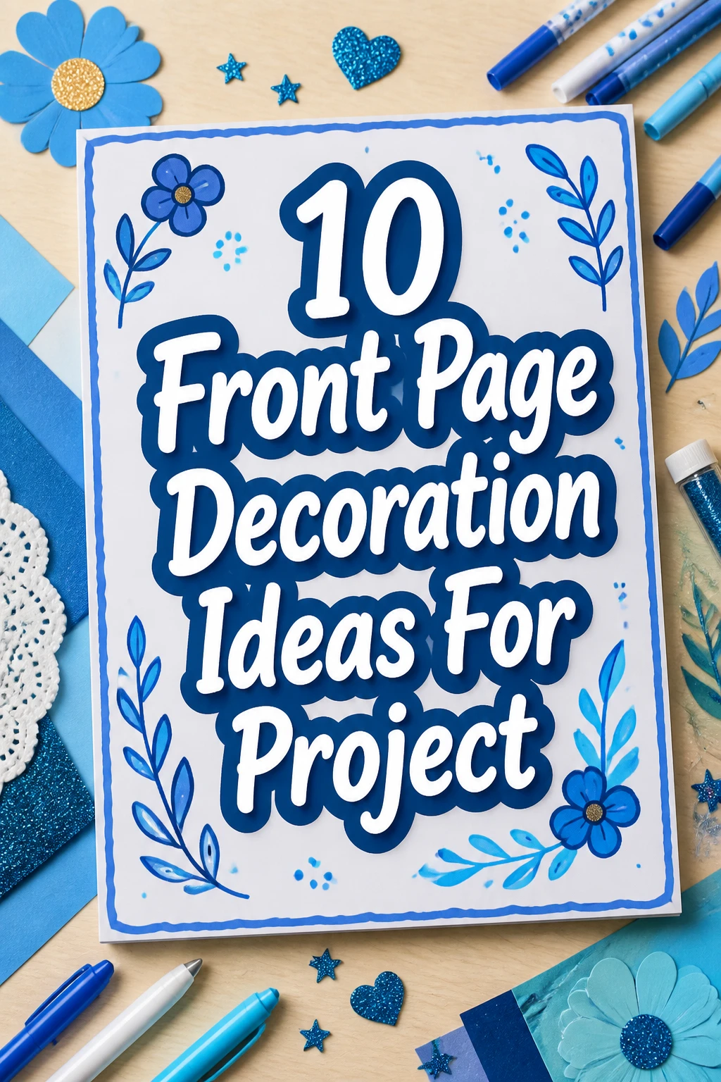
10 Front Page Decoration Ideas For Project
Staring at a blank project cover can feel like facing a panel of judges, right?
You want to make a killer first impression but your brain is currently running on empty.
Fear not, my friend. We are diving into some seriously cool front page decoration ideas that will make your project pop.
1. The Minimalist Masterpiece
- Best For: Serious academic reports, design portfolios, sleek presentations.
- Vibe: Clean, sophisticated, understated chic.
- Why it works: It screams confidence without trying too hard.
Grab some high-quality cardstock in a subtle shade like a muted gray or soft cream. Use a crisp, modern font for your title and name.
Perhaps add a single, elegant geometric shape or a thin line graphic in a contrasting metallic ink. Think subtle shimmer, not disco ball.
Pro Tip: Less truly is more here. Overdoing it defeats the entire purpose of minimalism.
2. Vintage Charm Collage
- Best For: History projects, literary analyses, artistic portfolios.
- Vibe: Nostalgic, quirky, handcrafted.
- Why it works: It tells a story before anyone even reads a word.
Hunt down old maps, sheet music, postage stamps, or even fabric scraps from an antique store. Arrange them in an overlapping, artful way.
Use a sepia-toned paper as your base for that authentic aged look. A touch of distressed ink around the edges adds to the effect.
Pro Tip: Vary the textures and sizes of your collage elements to create visual interest. Glue sticks are your friend, but don’t be afraid of a little fray.
3. Bold Geometric Pop
- Best For: Architecture projects, math presentations, modern art studies.
- Vibe: Dynamic, edgy, contemporary.
- Why it works: It grabs attention with sharp lines and vibrant hues.
Think abstract shapes in contrasting, super bright colors like electric blue and neon yellow against a deep charcoal background. Cut out triangles, squares, and circles from construction paper or use stencils.
Layer them to create a sense of depth and movement. Keep your text clean and sans-serif to let the graphics shine.
Pro Tip: Stick to a maximum of three strong colors to keep it looking intentional, not chaotic. We are going for art, not a toddler’s finger painting.
4. Nature-Inspired Botanical
- Best For: Environmental studies, biology projects, gardening guides.
- Vibe: Organic, serene, earthy.
- Why it works: It brings a refreshing, natural element to your work.
Press some real leaves or small flowers and carefully arrange them on your cover. Alternatively, use beautiful botanical illustrations or high-quality prints.
A soft green, brown, or off-white paper base complements this theme perfectly. Use a delicate, flowing script font for your title.
Pro Tip: Laminate your cover if you are using real pressed plants to protect them from accidental squishing. Nobody wants a crunchy cover.
5. Hand-Lettered Whimsy
- Best For: Creative writing projects, personal journals, art school assignments.
- Vibe: Playful, artistic, uniquely yours.
- Why it works: It shows off your personality and artistic flair directly.
Break out your best calligraphy pens, brush markers, or even just a trusty fine-liner. Experiment with different fonts and sizes for your project title.
Add small, simple doodles or flourishes around the text. A watercolor wash background can add a lovely soft touch.
Pro Tip: Practice your lettering on a separate sheet first. You want “charming” not “ransom note.”
6. Pop Culture Homage
- Best For: Media studies, film analyses, fan projects, creative presentations.
- Vibe: Fun, recognizable, conversation-starting.
- Why it works: It instantly connects with your audience through shared references.
Choose an iconic image or a specific color palette from your favorite movie, TV show, or video game. Think subtle nods rather than blatant rip-offs.
Maybe use a font reminiscent of a famous title sequence. A graphic element like a silhouette or a key symbol can work wonders.
Pro Tip: Ensure your chosen pop culture reference actually relates to your project topic. Otherwise, it just looks like you tried too hard.
7. Abstract Paint Splatter
- Best For: Art projects, creative briefs, anything needing a burst of energy.
- Vibe: Energetic, spontaneous, artistic.
- Why it works: It adds an immediate, eye-catching burst of color and movement.
Grab some acrylic paints and go wild with controlled splatters and drips on a sturdy paper. Use a few complementary colors for the best effect.
Let it dry completely before adding your title in a stark, contrasting color like black or white. A bold, blocky font works well here.
Pro Tip: Cover your workspace with newspaper. Unless you want your desk to become an abstract art piece too, which honestly, is not the worst outcome.
8. Map It Out
- Best For: Geography projects, travel journals, international studies.
- Vibe: Adventurous, global, informative.
- Why it works: It immediately sets a context of exploration and location.
Use a vintage map print as your background. You can highlight a specific region or country relevant to your project with a small, contrasting sticker or a drawn border.
Place your title over a less cluttered part of the map so it is easily readable. A compass rose graphic can be a nice touch.
Pro Tip: Find a map that is not too busy with details. Your title needs to be the star, not lost in a sea of tiny country names.
9. The Typographic Statement
- Best For: Design projects, literary analyses, presentations where text is key.
- Vibe: Bold, intellectual, modern.
- Why it works: It uses text itself as the primary design element.
Pick one incredibly strong, distinctive font for your project title. Play with different sizes and weights of that same font for your name or subtitle.
Arrange the text in an unexpected way, perhaps vertically or diagonally, or overlapping slightly. Keep the background plain white or a solid, deep color.
Pro Tip: Ensure the font is still legible despite its artistic arrangement. We are making a statement, not a puzzle.
10. Textured Fabric Overlay
- Best For: Textile design, fashion projects, home economics, sensory-focused topics.
- Vibe: Tactile, luxurious, unexpected.
- Why it works: It adds an incredible sensory dimension that stands out.
Attach a small strip or square of interesting fabric to your cover. Think burlap for an earthy feel, velvet for luxury, or even a piece of lace for delicacy.
Ensure it is securely glued down and does not make the cover too bulky. Print your title on a label or a contrasting paper and attach it over or next to the fabric.
Pro Tip: Choose a fabric that complements your project’s theme and does not shed fibers everywhere. Nobody wants a linty project.
Our Top Recommended Finds
- A high-quality craft paper assortment: Provides a great base for many of these ideas, offering various textures and weights.
- A precision craft knife and cutting mat: Essential for clean lines and intricate shapes, making your cutouts look professional.
- A reliable adhesive variety pack: Different glues for different materials (spray adhesive, glue sticks, strong liquid glue) will ensure everything stays put.
Which of these will you try first?
There you have it, folks! No more boring title pages for you. Now go forth and make that project front page unforgettable.
Which one are you going to tackle first to make your project shine?